
Santol Edge Team
AI Research & Engineering at Santol Edge
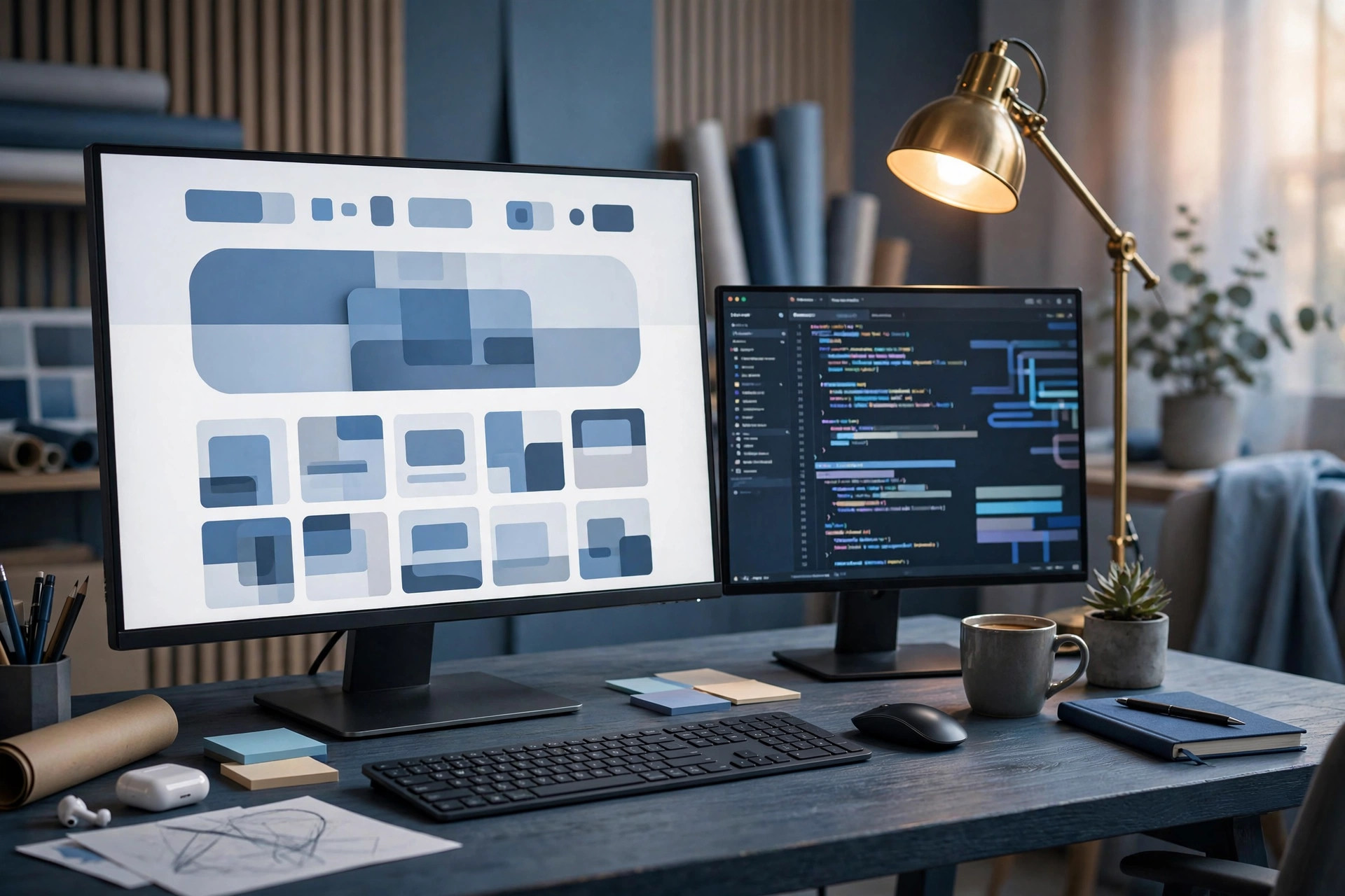

“Web Design for Event Planners: Building a Portfolio Website That Books Consultations”
Web Design for Event Planners: Building a Portfolio Website That Books Consultations
Web design for event planners has one job above all others: turn a visitor who is imagining their event into a consultation booking. The planner's work is visual, personal, and trust-based, and the website has to carry all three. Strong portfolio galleries show the range and quality of past events. Clear service and package pages explain what the planner does and how working together feels. A simple booking route turns interest into a conversation while the visitor is still excited. And everything has to work beautifully on a phone, because that is where most event research starts — often late at night, often shared with a partner or a colleague.
This guide explains what makes an event planner's website effective: portfolio presentation, service pages, consultation booking, mobile-first design, speed and search foundations, and the honest handling of testimonials and reviews. It is written for planners who want a website that works as hard as they do, not a digital brochure that sits quietly.
The Visitor Journey: From Inspiration to Consultation
An event planner's visitor usually arrives with a feeling, not a specification. They have a wedding, a corporate gathering, a milestone celebration, or a conference in mind, and they are looking for someone who understands it. The first seconds of the visit answer an emotional question — does this planner get events like mine? — and the next minute answers practical ones: what services are offered, what the process looks like, what it might cost, and how to start.
Good design serves both questions in order. The homepage opens with the planner's strongest work and a clear statement of who they serve. Service pages follow, organised by event type — weddings, corporate events, social celebrations, conferences — each with its own gallery, process description, and next step. A visitor planning a wedding should land in a world that feels like weddings; a corporate client should land in one that feels like theirs. Mixing everything into one undifferentiated gallery forces every visitor to do the sorting themselves, and most will not bother.
The journey should end the same way on every page: a clear, low-pressure route to a consultation. Not a demand, not a wall of form fields — a simple offer to talk about their event, with a choice of times, and an honest note about what the consultation covers. That is the conversion the whole site is built for, and it should never be more than a click or two away.
Portfolio Galleries That Sell the Experience, Not Just the Photos
Photography is the planner's strongest evidence, and gallery design is where many planner websites succeed or fail. The principles are simple. Show range: different venues, scales, styles, and budgets, so visitors can picture their own event. Show detail: table settings, lighting, florals, and the small touches that show care, not only wide shots of empty rooms. Show people: guests enjoying the event, because events are ultimately about people, not decor.
Each gallery or project page should carry a brief, honest description: the type of event, the venue type, the planner's role, and what made it distinctive. It should not invent details, name clients without permission, or present styled shoots as real client events without saying so. Visitors trust planners who are transparent about their work; a styled shoot labelled as one is a legitimate showcase of vision, while one presented as a client event is not.
Galleries also need to perform. Images should be optimised so pages load quickly on mobile connections, with sensible file sizes and modern formats. A gallery that takes too long to load loses the very visitors it was built to impress. Captions should be short and helpful, and every gallery page should end with the same consultation route as the rest of the site. For the technical side of gallery and page performance, our website speed optimization guide sets out the foundations that keep image-heavy pages fast.
Service and Package Pages: Clarity Before Price
Event planners often struggle with how much to say about pricing. The honest answer is that most planners cannot quote accurately without a conversation — but visitors still need enough information to decide whether to enquire. Service pages should explain what is included in each service: full planning, partial planning, day-of coordination, design-only, or corporate event management, as applicable. They should describe the process: an initial consultation, a planning timeline, vendor coordination, and on-the-day management. And they should give a realistic sense of investment: starting figures or typical ranges where the planner is comfortable sharing them, with a clear note that final pricing depends on the event's scope.
Package pages work best when they compare simply: what each level includes, what it does not, and who it suits. Avoid jargon and avoid overwhelming the visitor with options. Three clear levels, honestly described, convert better than a long menu. And every package page should answer the question the visitor is really asking: what will it feel like to work with this planner? Process descriptions, timelines, and the planner's approach to vendor relationships and problem-solving all help answer it. A related niche shows the same pattern well: our guide to web design for wedding planners covers service-page structure for a closely related audience.
Consultation Booking: Removing Every Point of Friction
The consultation booking is where interest becomes a client, and friction here is expensive. The booking route should be short: name, contact details, event type, approximate date, and anything the visitor wants the planner to know. Long forms with a dozen required fields lose people; the details can be gathered in the consultation itself. Offering real calendar slots — rather than a form that promises a reply — removes the waiting game entirely, and reminders keep the consultation from being forgotten.
The confirmation matters too. It should tell the visitor what to expect: how long the consultation lasts, what the planner will ask, whether it is by phone or video, and what happens afterwards. That preparation makes the consultation more useful and more likely to convert. And for planners who also use chatbots or voice agents, the same booking logic can run across channels: a visitor chatting on the website can book the same way as one who called. The principle is identical in other client-facing niches, as shown in our article on a chatbot for wedding planners.
Mobile-First Design: Where Event Research Actually Happens
Event research happens on phones, in spare moments, and often with someone else looking over the visitor's shoulder. A planner's website must be designed for that reality: galleries that swipe naturally, text that reads without pinching, booking buttons that are easy to tap, and forms that work with a phone keyboard. Navigation should be minimal — services, portfolio, about, contact — with the consultation route always visible.
Mobile-first is not a technical nicety; it is the business reality. A site that looks beautiful on a desktop but is awkward on a phone will lose the majority of its visitors. Testing should happen on real phones, on ordinary connections, with real galleries loaded. If a page is slow or fiddly on a phone, it is failing, whatever it looks like on a large screen.
Testimonials and Reviews: Honest Evidence, Properly Handled
Testimonials are powerful for event planners, because the purchase is personal and the stakes are high. They must also be handled with complete honesty. Only use words from real clients, with their permission, presented as they were given — not rewritten into praise, not attributed to people who did not say them, and not invented to fill a page. Where a client prefers not to be named, use a first name and event type only if that is what they agreed to. Where a planner is new and has few client testimonials, say so by showing the work itself: galleries, process, and approach, rather than fabricated praise.
Reviews from public platforms can be linked to, rather than copied, so visitors can read them in context. A small number of genuine, specific testimonials — describing what the planner actually did, and how the event felt — is worth far more than a page of generic superlatives. Trust, once lost on this point, is very hard to regain, and planners trade on trust above all.
Speed, Search, and Staying Findable
A beautiful site that nobody finds helps no one. The search foundations for an event planner's site are straightforward: clear page titles and descriptions for each service and event type, headings that use the words clients actually search for, fast-loading image-heavy pages, and local relevance where the planner works in a defined area. Content should answer real questions: how far in advance to book a planner, what a day-of coordinator does, how corporate event planning differs from social events, and what to expect from a first consultation.
A blog or resources section answering these questions steadily builds visibility and gives the planner material to share. Each article should be genuinely useful, not a sales pitch, and should link naturally to the relevant service page. Over time, this is what separates a site that is found from one that is merely published. For the page-level practices that support this, our landing page best practices guide covers the structure that turns visits into enquiries.
What a Website Project Costs and How It Proceeds
Costs for an event planner's website depend on scope. A business website or redesign starts from $1,200, and a custom web application with booking, client portals, or deeper integrations starts from $2,500. Every project is a fixed quote after a free consultation, so the planner knows the exact price before committing. Care plans for ongoing updates and support are quoted individually, based on what the planner needs.
The process starts with a discovery conversation: the planner's services, ideal clients, best past events, and the inquiries they want more of. Design follows, built around real photography and real content, reviewed together before any code is written. Build, testing on real devices, and launch follow, with redirects planned for any existing links. The planner reviews the site and tests it personally before launch. After launch, the site is monitored and improved on evidence: which pages lead to consultations, and which lose visitors.
Frequently Asked Questions
How many pages does an event planner's website need?
Enough to serve each audience separately: a homepage, a page per service or event type, a portfolio section, an about page, and a contact/booking page. More pages are added only where a distinct audience or service justifies them. A small, focused site that converts beats a large site that confuses.
Should I show prices on my website?
Show enough to help visitors decide whether to enquire: starting figures or typical ranges where you are comfortable, with a clear note that final pricing depends on scope. Withholding all pricing information can deter good inquiries; inventing figures you cannot honour will damage trust. Honest ranges, honestly explained, work best.
Can I use styled-shoot photos in my portfolio?
Yes, labelled honestly as styled work. Styled shoots show vision and taste legitimately. Presenting them as real client events, or using other planners' work, is not acceptable and will damage trust if discovered.
How do I get testimonials if I am just starting out?
Ask early clients directly, after the event, for a few honest sentences about their experience, and use them only with permission. Show your work, process, and approach prominently while testimonials accumulate. Never invent testimonials, and never present a vendor's praise as a client's.
How long does a planner's website take to build?
Most business websites launch in a few weeks, depending on pages, content, and photography readiness. The main variable is usually content: galleries and service descriptions take time to prepare well. A realistic timeline is agreed before work starts.
Will the site work well on phones?
It must, and it is tested on real phones before launch: galleries, forms, booking, and navigation. Mobile-first design is standard for planner websites, since that is where most event research happens.
Ready for a Website That Books Consultations?
Tell us about the events you plan and the clients you want more of. We will design a website that shows your work and books the conversation. Contact us for a free consultation and a fixed project quote.
Santol Edge Team
AuthorWrites extensively about generative AI, autonomous agent design, enterprise automation architectures, and customer experience engineering at Santol Edge.
Read Next

How AI Automation Helps Modern Businesses Scale 10x Faster
Discover how forward-thinking companies are deploying intelligent agents and automated pipelines to reduce overhead and boost revenue.
How AI Chatbots Transform Customer Support and Business Growth
Learn how AI chatbots improve customer response times, qualify leads, support teams, and create more consistent customer experiences.

AI Voice Agents: What They Are and How They Work
Understand where voice agents add value, how they connect with business systems, and what to consider before launching one.
Community Comments (0)
Oct 27, 2026Elisa Gabriella
VP of Operations · BrightSync
“A genuinely useful piece — the point about consolidating thin pages matches what we saw on our own platform last year. Deploying automated workflows cut roughly half our manual ticket volume and resolution speed went up significantly.”
Leave a Reply
Your email address will not be published. Required fields are marked *